Let’s look at the new Colorado Basin River Forecast Center graphic of projected runoff into Lake Powell, shall we?
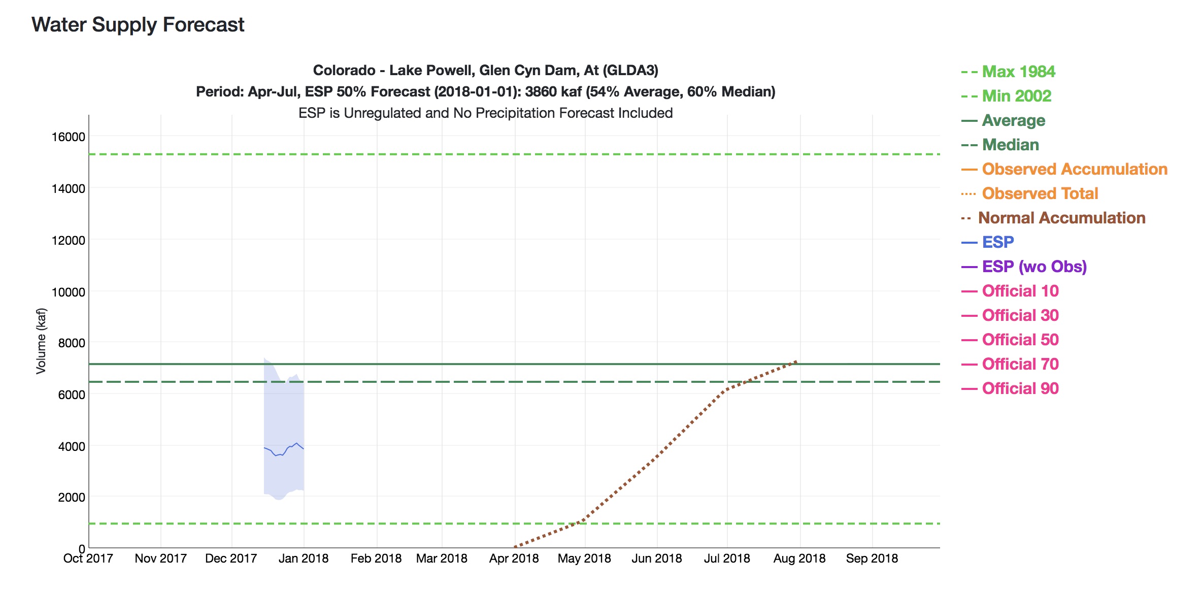
Jan. 1, 2018 Colorado Runoff projection for Lake Powell inflows, courtesy CBRFC
The folks at CBRFC has done a lovely update of their graphical presentation. The story it’s telling right now – not so lovely.
Let’s take this step by step.
First, the green lines in the middle of the graph. Those are “average” for the April-July runoff, where the solid line is the mean, and the dotted line is the median. (UNM WRP students, there’ll probably be a question at some point on the quiz about the difference, and why you’d choose one or the other for policy discussions. Prof. Fleck is just kidding, right?)
The dark blue line is the automated forecast, based on current snowpack and some mathemagic the CBRFC uses that we all trust. The light blue band is essentially the error bounds, where the top of the bar says there’s a one in ten chance it’ll be that high, and the bottom a one in ten chance it’ll be that low.
Then, reading left to right, the X axis is the date of the forecast. So the fact that the blue line is below 4 million acre feet means that when they did their mathemagical incantations (I believe that’s the technical term) on Jan. 1, they concluded that there’s a wide range of possible runoffs, spread from just above 6 million acre feet to just above 2 million acre feet, with a midpoint a bit under 4 million acre feet of inflow into Lake Powell this runoff season.
But another way, this is really, really bad. Or, as one of the smart managers said in an email this morning, “sobering”.
Here’s the link, so you can join us in clicking obsessively while we worry.