There’s a graph I’ve bumped into a couple of times recently that is absolutely breathtaking:
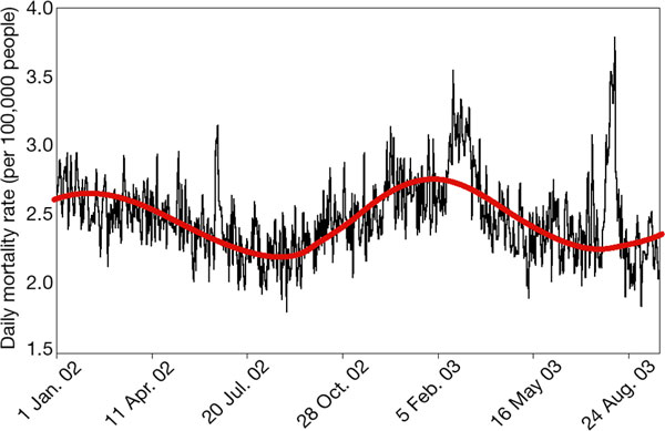
It’s the death rate in Baden-W?rttemberg, Germany, from January 2002 through August 2003. You can see the clear annual pattern, with more deaths in winter and fewer in summer. There’s a small spike in June 2002, which is apparently from a heat wave, and a larger peak in the late winter of 2003 – an influenza outbreak. And then there’s that massive peak in the summer of 2003, which was what climate researchers have demonstrated was a statistical outlier of extreme proportions. It was real hot.
(click through for more)
The figure, originally published here, was included in Christoph Sch?r and Gerd Jendritzky’s News and Views in the Dec. 2 Nature(1), which is where I first saw it.
I ran across it again last week in the slides from a presentation by British climate researcher Myles Allen at the COP 10 climate meeting in Buenos Aires earlier this month.
The International Federation of the Red Cross concluded that between 22,000 and 35,000 people died in Europe in the first two weeks of August 2003 because of the heat wave. The death rate in France was 54 percent higher during the heat wave. Those are daunting numbers, but I admit they didn’t quite sink in until I saw the Baden-W?rttemberg graph. The annual periodicity is so clear, the flu spike so obvious, and the heat wave death peak is, as a result, unmistakable. It’s obvious why people keep using the graph. It makes its point without a lot of fuss or ambiguity.
In the same way that it is hard to attribute a single heat wave to a particular cause – say, for example, greenhouse warming – it is hard to attribute a single death to heat. That is why it’s important to think statistically about these things. And that’s where a good graph can speak volumes.
It was Sch?r himself who offered a similarly power graph in a February paper(2) on the heat wave, showing where it fit in the long-term statistical distribution of temperature:
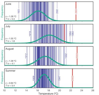
As you can see, in three of those four cases that’s about as far as you get out on the tail of the bell curve and still be on the same piece of paper.
It’s that sort of statistical thinking that the Baden-W?rttemberg graph offers.
1. Sch?r, C. & Jendritzky, G. (2004) Nature 432, 559-560.
2. Sch?r, C., Vidale, P. L., L?thi, D., Frei, C., H?berli, C., Liniger, M. A. & Appenzeller, C. (2004) Nature 427, 332 – 336.