
A bunch of disparate threads coming together here in one spot: climate change controversies, free software and a really hot weekend here in Albuquerque. (Don’t worry, skeptics. I’m not gonna blame the heat wave on global warming.)
The climateaudit guys, critics of the hockey stick, have done their analysis in R, which is a nice and freely available (GPL) statistical tool. The new reanalysis by Wahl and Ammann also uses R and both groups have published their code.
So I’ve been playing a bit with R, which is a fun toolkit.
(click through for more)
Which brings me to this weekend, where the temperature hit 96 yesterday in Albuquerque, setting a record for May 21 by a couple of degrees. But knowing it’s the hottest May 21st ever doesn’t tell us everything. For that, a nice histogram of May 21 temperatures would be nice:
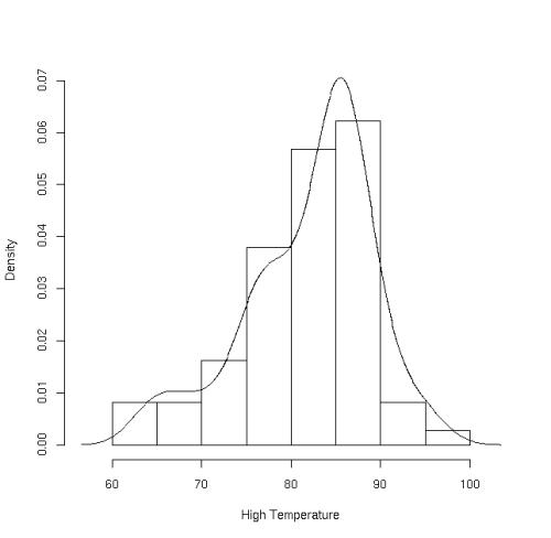
The data summary, from R:
   Min. 1st Qu.  Median    Mean 3rd Qu.    Max.
  64.00   77.25   84.00   82.11   86.00   96.00
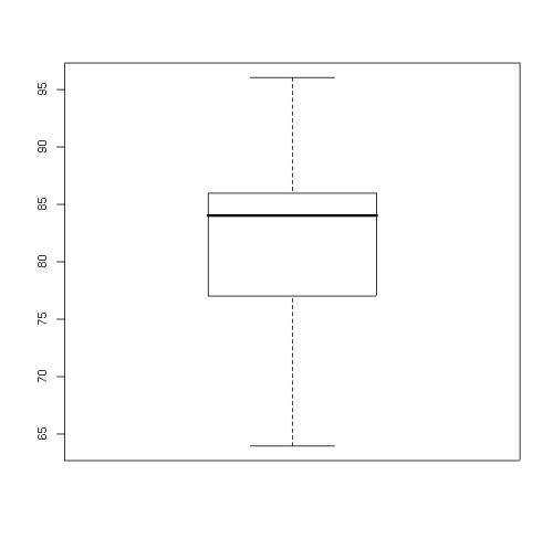
You can see the way the data skews to the cool side, which also is obvious in the box-and-whisker plot.
Apropos of nothing, really. I was just curious about the significance of yesterday’s temperature and was looking for a little data file to play with in R. Sorry, if y’all want to audit my work, I have no idea where I got the data, just an old file I had laying around.