Lauren Steely, late of the Bren School, did a neat analysis a few days ago to help visualize Oroville Dam inflow data. She’s using R’s joyplot tool, which is all the rage these days as a new day to line up and visualize variability in datasets that have repeating patterns.
Like, for example, the annual hydrograph on a river.
Here is the way I had been looking at data from the USGS gauge at Lees Ferry, downstream from Glen Canyon Dam on the Colorado River:
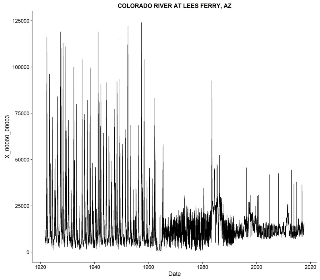
Lees Ferry Gauge, Colorado River, data courtesy USGS
It tells a story. You can see the change when they completed Glen Canyon Dam in the early 1960s, and the huge flows in 1983 and for several years after. (See The Emerald Mile.) But it’s kinda squinty and dorky.
I’m not much of a programmer, but happily Lauren shared her code, which I adapted to my data problem. Here’s the same data in a joyplot:
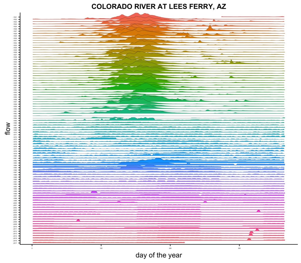
joyplot of USGS Lees Ferry Gauge
The blank lines in the early 1960s are when they were first filling Lake Powell. The little nubs in the bottom right are the Glen Canyon Dam/Grand Canyon experimental environmental pulses.
The mountain ranges in the upper center are what a river looks like before you build the dams.
Pingback: That time we built a dam in Glen Canyon, annotated and revised - jfleck at inkstain