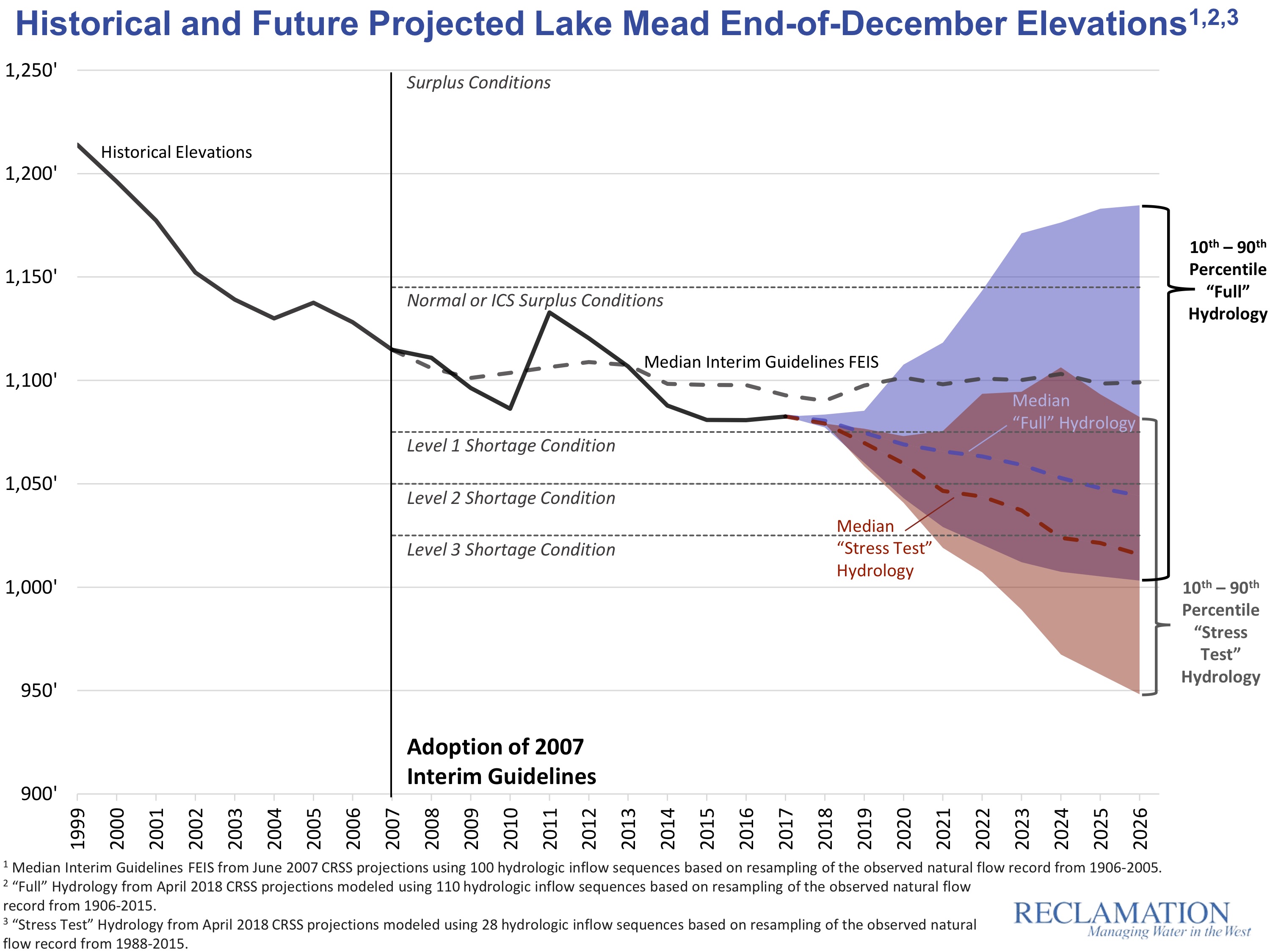
The conventional calculation of Colorado River shortage risk, which people like me frequently report, shows a 51 percent chance of Lake Mead dropping into “shortage”, below the magic trip line of elevation 1,075 at which mandatory cutbacks kick in, in 2020. But a new approach to modeling risk, which lots of folks (*cough* me *cough*) think more accurately represents the changing climate, shows a significant risk of a much quicker drop in Lake Mead’s levels, blowing quickly past 1,075, with a greater than 50 percent chance of dropping below 1,050 sometime in 2020. Absent actions to reduce water use, Lake Powell has a greater than one in four chance of dropping near power pool (the level at which it could no longer generate electricity) by the mid-2020s.
It is to the Bureau of Reclamation’s credit that they’re not only running the new modeling methodology in parallel with the more traditional approach, but that they’re doing this in a very public way, presenting both last week at the Basin States principals meeting in Santa Fe as part of the federal effort to get negotiations over water use cutbacks back on track.
Here’s the Mead graph showing the traditional modeling approach (the blue) and the newer “stress test” (shown in red):
 I like this graph (kudos to Carly Jerla and the other wizards at the Bureau for coming up with such a clear visualization) because of how intuitively it shows how different the answers are when you use the two different approaches. Especially visually striking is the probability “cloud” showing the statistical range of possibilities. The old blue approach shows a decent chance of wetness refilling reservoirs. The newer red approach not only offers no such blue bits of optimism, but shows some statistically credible chances of Lake Mead seriously tanking very soon.
The difference between the two modeling approaches gets to the heart of the importance of the “period of record” you use to analyze river flows in support of decision-making.
The traditional (blue) approach uses historic river flows from 1906 to 2015 as the basis for a statistical simulation of the range of possible futures given current reservoir levels. This is classic “stationarity” – assume the future will be like the past. The specific model then uses what’s called the “index-sequential method” (ISM), which is a bog standard way of modeling the statistics of river flows.
The new approach (red), which has come to be known as the “stress test”, is based on the view of some water managers and scientists that the old full-record approach is understating risk, because the past climate – especially in the case of the Colorado River that exceptionally wet first quarter century of the record – is putting more water in the river in your simulations than we can realistically expect any more because of a warming climate. The stress test still uses the ISM, but instead of the full record, it uses 1988-2015, which seems more like a modern climate than the full thing back to 1906.

the debut of the “stress test”
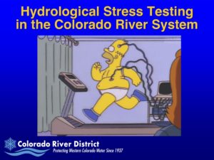
The “stress test hydrology” was pioneered by Eric Kuhn of the Colorado River District and John Carron of Hydros Consulting (disclosure I have worked with both of these people and Eric and I are writing a book about, among other things, the importance of the choices of the period of record used in the analyses that underpin today’s Law of the River). Eric and John began developing the technique in 2013 in response to then-Interior Secretary Sally Jewell’s call for the development of more robust drought contingency planning in the Colorado River Basin, and Eric first talked about it at the 2013 meeting of the Colorado River Water Users Association. (see Homer Simpson, right)
It’s important to understand that neither the full period of record, nor the stress test, is “right” in any objectively specifiable way. The question for water managers is whether the method you’re using is giving you an honest feel for the range of futures you have to manage for. It seems pretty clear to me that the red lines are telling us something really useful about the risks of climate change in our near term decision making that the blue lines miss, and that they are a more helpful way of thinking about what we should expect than the blue lines. In including these model runs in the presentation done by Bureau staff and Reclamation Commissioner Brenda Burman at Tuesday’s Basin States principals meetings, federal officials are sending a similar signal.
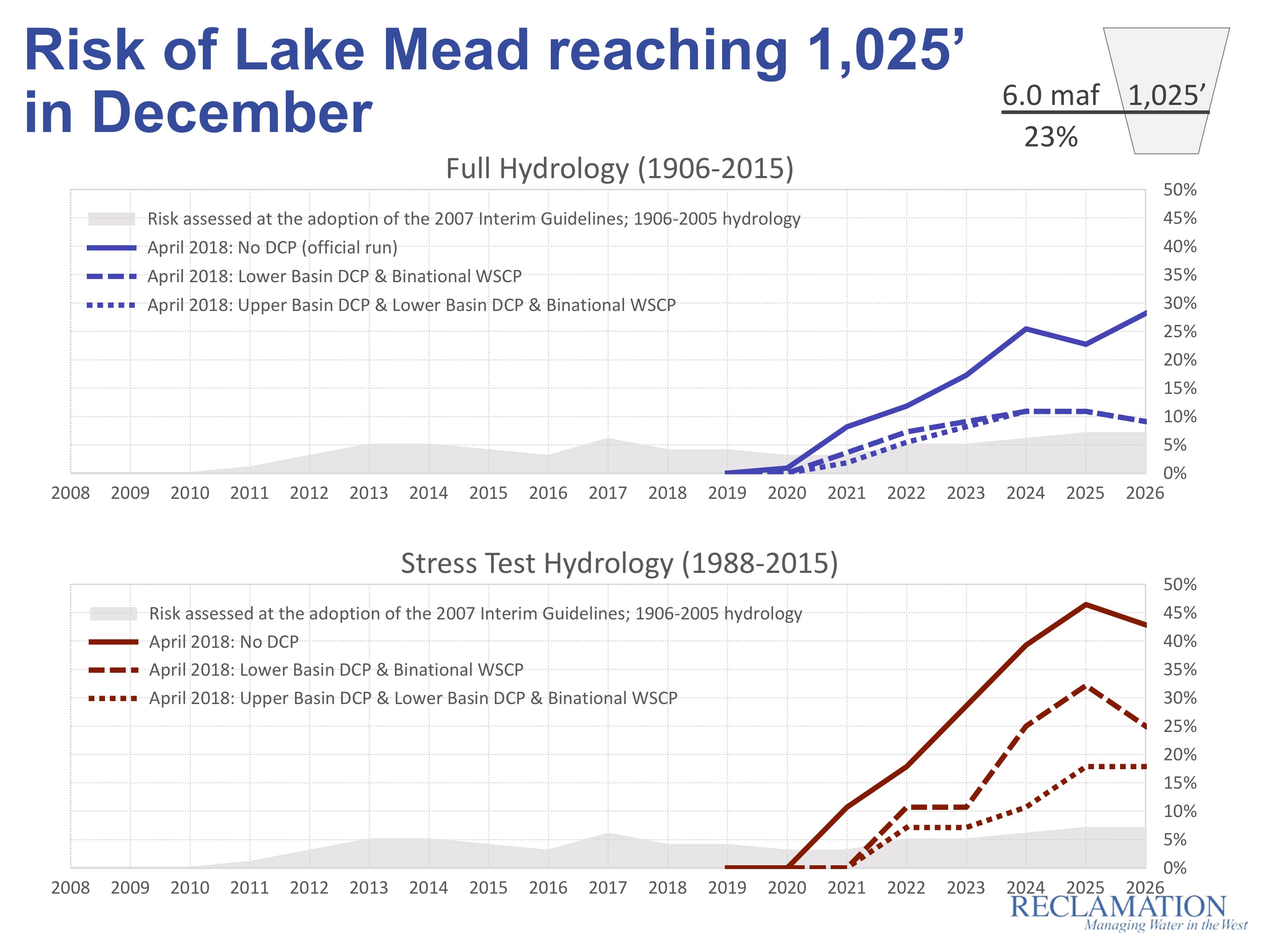
The point of all this is to inform decisions about getting the stalled “Drought Contingency Plan”, which would reduce water use and protect levels in Lake Mead and Lake Powell, back on track. Here’s a red line/blue line representation of the risks of Mead hitting 1,025, a level at which deep cuts will be inevitable. The solid line is the risk without a DCP, the dotted lines are the risks with various flavors of DCP:
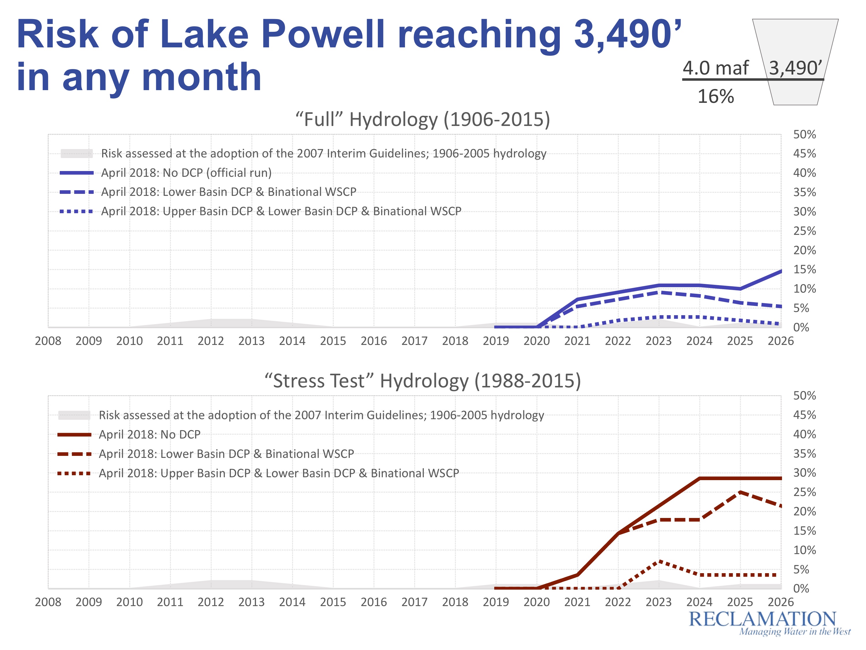
 And lest we forget, those of us in the Upper Basin face risks, too. Here’s the blue line/red line risk of Lake Powell reaching 3,490, which is the point at which Glen Canyon Dam can no longer generate electricity – a trip line we in the Upper Basin prefer not to approach, let alone cross:

Pingback: For central Arizona farmers, coming to terms with the reality that a Colorado River allocation is not an entitlement - jfleck at inkstain
Does that mean then that SJC deliveries to the RG may be curtailed?
Bill – Good question. No, at this point there’s no plan or, more importantly, process/procedures for curtailing New Mexico’s San Juan-Chama water. Other than bad hydrology, which makes SJC sort of self-curtailing if there’s not enough flows.
Wondering what document contains the original graphs, I’d like a higher resolution copy. Thanks!
The first graph would be even more dramatic if the ordinate were in acre-feet since elevation drop near the top would cause steeper drop in acre-feet.
Might be useful for two reasons. 1) Big numbers are less comprehensible that smaller numbers and acre feet would be better. 2) :Lake surface area / capacity curves almost always show that a unit drop in elevation at full capacity has greater loss in capacity than for a unit drop at any lower elevation.
Paul, Bill –
The question of which to use on the “y” axis depends on the audience. In this case, the audience was water managers, and reservoir elevation is the language they routinely use. When I make my graphs for general audiences, I use acre feet.
Pingback: Study: Small increases in Upper Colorado water use would cause big shortage risk – jfleck at inkstain