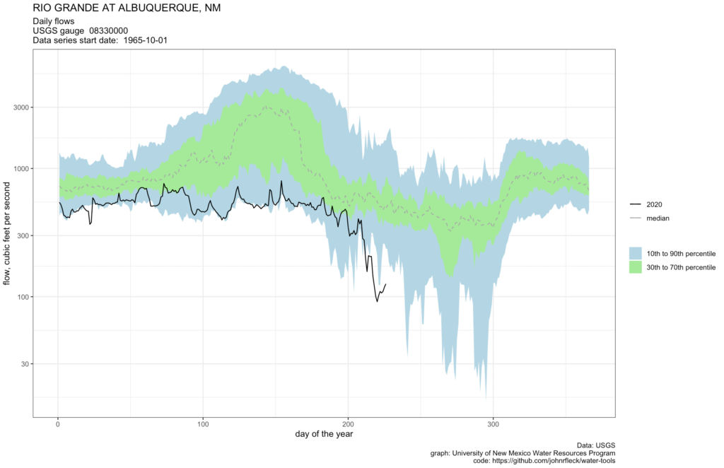
Figure 1: Low flows on the Rio Grande, log scale

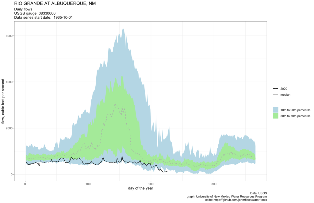
Figure 2: Low flows on the Rio Grande, linear scale
When there’s a lot of water in the Rio Grande, an extra 25 cubic feet per second is a “meh”. But right now, it matters a great deal.
Figure 2 above is the output of a script I use to track river flows (code here for those inclined). You give it a USGS gauge number and it downloads and plots the data. For my intuitions, the second graph is normally far more useful.
But at the extreme low flow numbers we’re seeing right now (lowest for this point in the summer since 1981), the log scale seems more useful, eh?

So these hydrographs are quite handy. I went and got the scripts, etc. But I have to get up to speed using R. That said, how quick can these be generated using that script. Let’s say there is a 4 hour learning time, but then once you got it down, can I generate these hydrographs for any gage (via USGS or using my data)?
Joel – Glad this might be of help!
Once you’re up the learning/setting up curve, it’s a matter of seconds to generate the graph for a given USGS gauge. The script prompts you for a gauge number and does the rest, pulling the data directly via the USGS NWIS API.
It would take a bit more hacking to adapt it to make similar graphs based on data you already have.