A freakish heat wave across
Words fall short as we watch the West’s snowpack disappear under the glare of a heat wave so off-the-charts, so freakish, that I had to resort to some pretty extreme math to try to understand how freakishly off-the-charts this is.
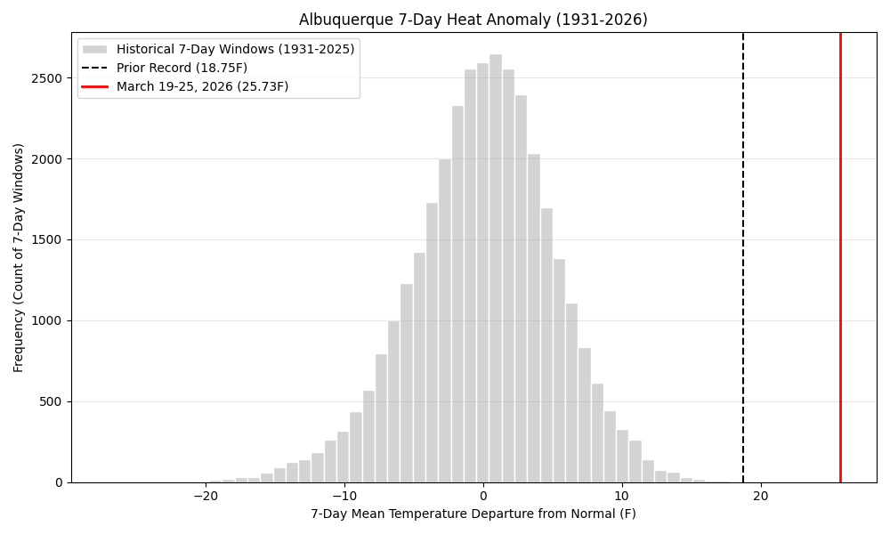
We’ve got more than a century of weather records in Albuquerque, with really good ones going back to the 1930s, and no seven day period, anywhere in the year, has come anywhere close to what we’re in the middle of. Based on the National Weather Service’s current forecast, the seven days from March 19 to 25 will be ~28F above average. In statistics nerd terms, that is more than 4 standard deviations outside the norm.
I’m on statistical thin ice here because we’re so far out on the tail of the distribution that we don’t really know what the statistical distribution of events like this is, but maybe once every 300 years – not for March, but for any time of the year. Maybe once in a very a lot more than that years.
The graph above, based on NWS data going back to the 1930s, is the most useful visualization I could come up with.
A note on methods
When I worked at the newspaper, I had a practice of hunting out weird weather data to turn into a story – the hottest this, the coldest that, the wettest, the driest. Weather data is so rich that you can slice it up a million different ways to come up with some extreme that was easy to sell to an editor.
This practice started with hanging around with National Weather Service forecasters in the pre-everything-is-on-the-Internet days, and then evolved with a bunch of crude tools for looking stuff up myself. It was a happy day for me when xmACIS moved from behind the Weather Service’s firewalls and into public view. I would use spreadsheets and learned to write R code and use government agency APIs to fuel my curiosity.
The tools available now for data access and analysis are amazing, and leaping ahead fast. My old pal Luis Villa from my Linux hacker days, now a lawyer and member of the OpenET board, has been talking a lot lately (I couldn’t find a blog post, a lot of this happens on Mastodon, which is the only social media I spend much time on any more) about the ways in which LLM coding tools can help unlock the power of open data.
I can sit there with my laptop in the evening and code up a tool to look at OpenET data on water use in New Mexico’s Middle Rio Grande Valley in a way that simply wouldn’t have been tractable in the before times. I have a decent understanding of the data, but I’m a lousy programmer, and the friction of writing code left a bunch of problems that I clearly understood – I know where the data lives, I know the kind of analysis I’d like to see done – out of reach. Now, I upload the job to Google Earth Engine (free for academics!), cook dinner, download the results, and stare mesmerized at the maps. The epistemological ice is thin under me as I look at the results, but that’s the way I’ve always worked. Out where the ice is thin is where things are interesting.