Driest Rio Grande flow on record
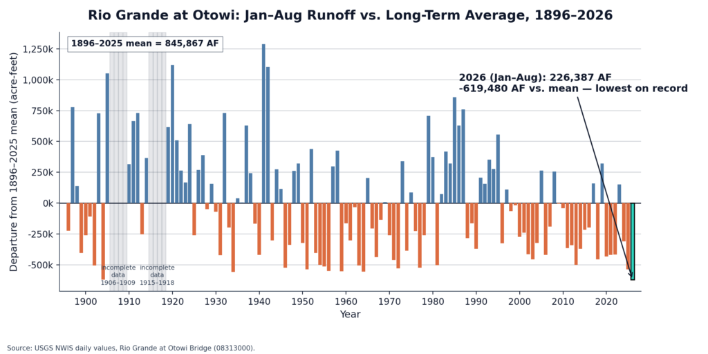
Updating my “drought and climate change” lecture each fall is a useful exercise – this year more useful than most. Much like the year itself, my slide deck is setting all time records for new data visualizations needed to make sense of the remarkable 2026.
Update
Great questions from the comments. (I love my commenters.) First, a request to include a smoother to make the trend more legible:
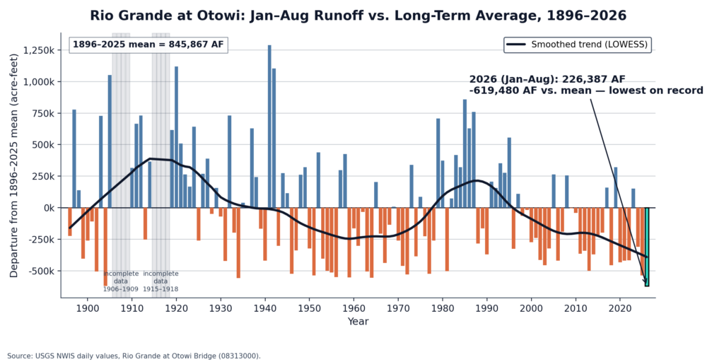
Now with bonus smoother.
Second, an observation that it looks like it tracks the Pacific Decadal Oscillation, a large scale pattern linked to drier conditions in the southwest. Good eye! A quick run of the numbers based on prior-year fall PDO shows a statistically significant but small (r squared explaining 6 – 9 percent of the variance) relationship.
Worth noting that this is all of the water flowing past Otowi, which is a function of climate and all the many human activities upstream (irrigation reducing flow, San Juan-Chama adding to flow). So it’s not solely a climate signal.
Weirdly, when I redid the analysis for the Del Norte gage, which is above the San Luis Valley diversions and should be a clearer climate-alone signal, the relationship disappears. No correlation at all with PDO, which surprised me.
Hey John, outstanding graphic! I am wondering if you might have another graphic that compares the departure from the mean for the Rio Grande and the Colorado River. How closely correlated are they? Thanks, much.
Looks like it tracks the PDO.
it would be helpful to draw a best fit curve. Many people don’t have the ability to interpret a graphic like that. They just see a lot of noice.
Nancy – Great suggestion! Added another version. Khalil – Good eye! Though my brief dive into that rabbit hole got weird, see explanation above.
Perhaps the human element showing up here is that because the DCO happens then people compensate for it by releasing more water from reservoirs? Dunno for sure. 🙂 When you have so many monkey wrenches in the system then perhaps trying to isolate factors becomes impossible. Chaos theory and all that…