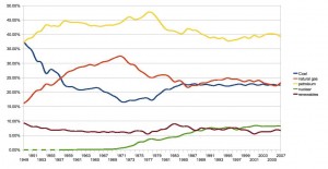
I’d been curious about what this graph might look like. From EIA:
(Source: EIA – click through to see it bigger)
The interesting thing is that the U.S. energy mix largely stabilized, in terms of the share of total consumption from the main sources, in the late 1980s, and has been relatively unchanged since. Why is this? Did it essentially converge on a stable economic optimum? What role, if any, did government policies have on the shape of the our energy mix pie chart over time, both in arriving at the post-1980s equilibrium and before?
I don’t know whether this graph is telling us anything profound, but as we head into what is billed as a serious attempt to change our energy mix in dramatic ways, it’s worth thinking carefully about what federal policies, if any, have had the ability to shape our energy mix in the past.


 For a journalist, making fun of California is a fish-in-a-barrel sort of thing, especially when it comes to water. But
