By what seems like a series of coincidences (or not?), I’ve been reading and writing and trying to write lately about maps – the information in them, the things cartographers leave out of them, their implications for understanding things about the world around us, and also the choices we make about what we don’t need to understand. So I’m launching a new category today on Inkstain: maps.
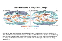
Today’s entry is Figure 6 from the IPCC report released yesterday. Given the frequent use of the phrase “global warming” as shorthand for this complex thing we all talk about, much of the attention ends up focused on temperature. This is reasonable, given that globally averaged temperature is an area of relatively greater understanding. But we don’t live globally. We live “here”, wherever “here” might be. And central to our life “here” is how much precipitation falls from the sky. Figure 6 in the new report attempts to convey in a visually understandable way what is known and not known about this centrally important issue.
The map’s color choices are obvious: brownish means dry, blueish means wet. (As an aside, I was at a talk yesterday where a guy used the opposite color scheme on a climate map – the red end of the rainbow for wet anomalies, blues and greens for dries – very confusing.) But beyond wet and dry, there’s a second kind of information that we also need to know, which is the confidence of the forecast. Places with no confidence are just left white. Places with higher confidence get a little stippled overlay.
I found this map very useful yesterday as I was writing about the IPCC report.